
Monday, June 20, 2011
Final Exam

Tuesday, May 17, 2011
Art Deco Travel Poster

To start I chose a picture of a sunset in Paris where you could see the Eiffel Tower but it was not the center of the picture, so that I could add in the airplane and it would not look too overcrowded. I then opened the picture in Illustrator and simple traced the photo to make the shapes simpler. I replaced the colors of the Eiffel Tower, the city, and the street with textured designs. Then I moved the picture into Photoshop and set it as my background. I got a pictured of an airplane and opened it in Illustrator, and simple traced the picture and deleted the background. I moved it into Photoshop and then I decided to use a simple text and font in keeping with the simplicity of art deco.
These are the photos I used:


Thursday, April 14, 2011
Social Awareness Poster
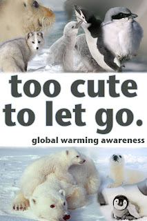
For my social awareness poster project I decided to promote the global warming awareness cause. At first I was going to promote recycling by showing pictures of animals that were being affected by the lack of recycling around the world. However it began to be hard to see the clear connection automatically between recycling and the endangered animals when you looked at the poster without an explanation. So, I decided to switch to global warming awareness because it is a big issue that is controversial and therefore would get people's attention. I chose pictures of endangered animals as the background to my message to show people who was being affected negatively. I decided to use mostly babies in the pictures because I thought the innocence of the babies would appeal to more people. I chose to make the letters gray and put a light glow around the words to make the words look softer and blend better with the pictures.
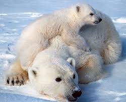
I found my pictures using Google Images and searching endangered animals first, and then specifying certain animals, like penguins and seals. These are the original images I used:


Thursday, March 10, 2011
Thursday, February 17, 2011
My Logo Designs

This is the logo I chose for my initials. I was trying to put my initials in shapes and then ended up putting them next to each other in a shape. I tried to make them overlap, but I'm still working on that. I picked red and blue because they are complimentary colors, and they also complimented the design.


For the name with symbol logo I wanted to use different tools and strokes. I tried to find a font that had straight edges so that it would match the wand I made that has straight edges. The top of the 'i' I made with a flare to seem like the wand did something to it.
Tuesday, December 14, 2010
Expressive Typography
  |
| Click to enlarge. |
 |
| Click to enlarge. |
Tools I used:
- Pathfinder
- Text Tool
- Place
- Live Trace
- Expand
- Create Outlines
- Ungroup
- Group
- Gradient
- Patterns
Monday, December 13, 2010
AI Vectordiary Days 8-12
 |
| Tutorial Days 8 - half of 9 |
Tools I used and for what:
- Brush tool: pear and A
- Rectangle tool: all of the rectangles in all the days
- Circle tool: all of the circles used to illustrate all the different options
- Star tool: the stars used to illustrate the point options
- Border, Color, Transparency, Gradient, and Graphic Styles Windows: all of the options shown in the stars and circles
 | ||||||
| Tutorial Days 9-12 |
Friday, November 12, 2010
Spaceship
 |
| My spaceship going to the Moon. |
Tools I used and for what:
- Ellipse tool, Delete Anchor Point tool, Rectangle tool, Convert Anchor Point tool, Pathfinder: Intercept shape areas/Subtract from shape areas, Gradient, and Star tool
- Delete Anchor Point tool:
- take away anchor point on the window to change it from an oval to a window shape
- Convert Anchor Point tool:
- change the shape of the engines
- Pathfinder:
- Subtract and put together different objects
- Gradient:
- coloring in the background and on ship body
- Star tool:
- stars in the background
- Rectangle tool:
- fins, background, and engines
- Ellipse tool:
- Body, flames, shadows, moon, and window
I would give myself a 9/8 (participation/product) because I was focused while I made the spaceship, but it took me a while to make this post, and I'm pleased with my final project, but some things could be tweaked, like the background gradient is backwards, and little parts along the spaceship aren't lined up perfectly.
Illustrator Project Days 1-5
 |
| Click to enlarge |
Tools I used and for what:
- Shape tools: Rectangle tool, Star, Ellipse, Polygon
- Used them for the rectangle, square, triangle, pentagon, 20-point star, oval, and circle
- Drawing tools: Pencil, Pen, and Change Anchor Point tool
- Used them for heart, hands, old key, dog bone, shamrock, clover, leaf, speech bubble, puzzle piece, and (my favorite) the rabbit
I think that I got better with the tools towards the end of the project, and I went back and changed some of the objects once I was used to tools like the pen tool. It took me a while to figure out the pen tool and drawing/tracing the hands took the most time. I think I could have done some of the objects better, like the dog bone or the speech bubble, but overall I think the images I made are good.
My personal evaluation of how I did is a 9/8 (participation/product), because I think I completed the project well, but some of the images could have been better. I was focused for most of the project,with maybe some minor lapses.
Tuesday, October 19, 2010
Photoshop KO designs


Thursday, September 23, 2010
field hockey
Yesterday we (the field hockey team) played Morris Knolls, at Morris Knolls. We scored first in the first 5 minutes, then they scored with 45 seconds left. In the second half we scored again towards the end of the half, but they scored with 30 seconds left. We went into overtime, but neither team scored, so we ended in a tie. We play Chatham on Saturday at Chatham, we've been away all week.
Tuesday, September 21, 2010


Monday, September 20, 2010
Subscribe to:
Posts (Atom)