Monday, June 20, 2011

Final Exam

For my final exam in Graphics 1 I decided to use a project I had already done. I used a picture of a wall with graffiti and overlapped another picture with two guys spray painting another wall. I cut out the two guys and the pavement they were on an placed new shadows on top to make it seem like they were all part of the same photo. To decide what I wanted to say on the poster I thought about what people think graffiti is and how graffiti artists view their work. I think most people view graffiti as a waste and an eye sore, but people put a lot of work into the art and it takes skill to use the spray paint to create the images that we see on walls. I wanted to use something short that people could read easily and would remember. I decided to use a phrase that was popular and rhymed so people would easily remember what I was trying to convey.  I used a simple font and font color so that it would not be battling the artwork in the background, which is the focus of the message. I did not want it to completely blend in with the graffiti so people could easily pick out what I wanted to say, but it would not take away from the artwork.

Tuesday, May 17, 2011

Art Deco Travel Poster

For my second poster project I decided to do an art deco travel poster for France. I looked up tutorials online for art deco in Photoshop, and mostly only came up with tutorials for art deco style type. So instead I used a tutorial from a graphic design magazine I got from my teacher. I researched what made something art deco-like, and for the most part art deco designs are made up of simple shapes and color replacements.

To start I chose a picture of a sunset in Paris where you could see the Eiffel Tower but it was not the center of the picture, so that I could add in the airplane and it would not look too overcrowded. I then opened the picture in Illustrator and simple traced the photo to make the shapes simpler. I replaced the colors of the Eiffel Tower, the city, and the street with textured designs. Then I moved the picture into Photoshop and set it as my background. I got a pictured of an airplane and opened it in Illustrator, and simple traced the picture and deleted the background. I moved it into Photoshop and then I decided to use a simple text and font in keeping with the simplicity of art deco.

These are the photos I used:

Thursday, April 14, 2011

Social Awareness Poster


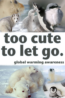
           For my social awareness poster project I decided to promote the global warming awareness cause. At first I was going to promote recycling by showing pictures of animals that were being affected by the lack of recycling around the world. However it began to be hard to see the clear connection automatically between recycling and the endangered animals when you looked at the poster without an explanation. So, I decided to switch to global warming awareness because it is a big issue that is controversial and therefore would get people's attention. I chose pictures of endangered animals as the background to my message to show people who was being affected negatively. I decided to use mostly babies in the pictures because I thought the innocence of the babies would appeal to more people. I chose to make the letters gray and put a light glow around the words to make the words look softer and blend better with the pictures.

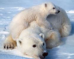
           I found my pictures using Google Images and searching endangered animals first, and then specifying certain animals, like penguins and seals. These are the original images I used:
 

Thursday, February 17, 2011

My Logo Designs


This is the logo I chose for my initials. I was trying to put my initials in shapes and then ended up putting them next to each other in a shape. I tried to make them overlap, but I'm still working on that. I picked red and blue because they are complimentary colors, and they also complimented the design.


I wanted to have my first and last name connected somehow, so I tried connecting letters as ligatures, but then it did not seem like a logo you would see. So I chose to make my first name smaller  and my last name bigger to have something to look at that could be recognizable.


For the name with symbol logo I wanted to use different tools and strokes. I tried to find a font that had straight edges so that it would match the wand I made that has straight edges. The top of the 'i' I made with a flare to seem like the wand did something to it.

Tuesday, December 14, 2010

Expressive Typography

Click to enlarge.

Click to enlarge.
For this assignment we had to use new techniques to turn letters into shapes, and shapes into letters, which we will use later to create our logo designs in the next project. We followed the assignment on our teacher's blog, MrBoothby.net. We did 4 examples for each, though I did 5 for the figure-ground reversals and symbol replacement and 7 for the ligatures because I was unsure of previous ones, or I just wanted to do another. We did stacked text, for which I typed my word then created their outlines and ungrouped, making them separate shapes. I then moved them so that they were touching and made them one shape, then made copies and rotated them until 4 copies were stacked on each other. I made them one shape using Pathfinder and Expand. For figure-ground reversal I typed out the alphabet then made a rectangle. I made each letter a separate shape placed them so that they were touching within the box. I used Pathfinder-Add-Expand to make them all one shape, then I could go back in and fill in spaces and cut out negatives of other letters I didn't use. For symbol replacement I searched for pictures of objects with white backgrounds that resembled letters. I decided to make a theme of colors, so I used shapes that resembled the letter and were the same color as the word. I would place the picture in Illustrator and use Live Trace to make it a shape. Then I would place the object where I wanted it, delete the background and group the whole word together. For ligatures I first had to pick words that had letters that could be connected in different fonts. To think of words to use I first typed out the alphabet in certain fonts then decided which letters I wanted to put together and then what words to use.

Tools I used:
  • Pathfinder
  • Text Tool
  • Place
  • Live Trace
  • Expand
  • Create Outlines
  • Ungroup
  • Group
  • Gradient
  • Patterns
My personal evaluation for this assignment would be a 10/9, participation/product. This is because I worked hard on each part, but I had trouble with the figure-ground reversal, and so my examples of them aren't the best.

Monday, December 13, 2010

AI Vectordiary Days 8-12

Tutorial Days 8 - half of 9
 For this assignment we had to follow the tutorial we had previously followed, Vectordiary, through days 8-12. The first day was difficult because we were getting used to using the brush tool to create the pear and then the A. It was fun to play around with the borders and strokes, then the colors and shapes. Other than getting used to the brush tool, Days 8, 10, 11, and 12 were fairly easy. The most difficult day overall was Day 9, because that was the day we did the old key. We had to do the most on multiple shapes that we had done so far in order to create the key. For the most part it was straight forward, but getting used to the order of what you had to use was difficult.

Tools I used and for what:
  • Brush tool: pear and A
  • Rectangle tool: all of the rectangles in all the days
  • Circle tool: all of the circles used to illustrate all the different options
  • Star tool: the stars used to illustrate the point options
  • Border, Color, Transparency, Gradient, and Graphic Styles Windows: all of the options shown in the stars and circles
 For my personal evaluation I would give myself a 10/9, participation/product, because I completed the assignment in a timely matter, but some of the tools I think I might have misused because they didn't appear the same way they did on the Vectorydiaries blog.
Tutorial Days 9-12